How to read the Dashboard.
A practical walk-through of every panel — the MQN direction chart, volatility, breadth, leadership and data health — and how to turn them into a single regime read before you risk money.
Trade the market type, not your opinion
This dashboard is a daily operating system for systematic traders.
Its purpose is not to predict tomorrow. Its purpose is to tell you what type of market you are trading today, where strength is building, where weakness is spreading, and which of your tested strategies deserves capital under current conditions.
Professional trading is a business. A business needs rules, measurements, feedback, and repeatable decisions. This dashboard gives you a structured way to answer the same questions every day before you risk money:
- What is the general market direction?
- Is volatility quiet, normal, volatile, or extreme?
- Which markets, sectors, countries, themes, and asset classes are leading?
- Is participation broad or narrow?
- Which strategy playbook fits the current environment?
The dashboard does not replace your trading system. It tells you the environment in which your system is operating.
Start with the Regime tab
The Regime tab answers the first question: What type of market are we in?
We use SPX (via a SPY proxy) as the broad-market reference because the S&P 500 is the main risk barometer for many equity, sector, macro, and cross-asset strategies. The goal is not to trade only SPX — it is to understand the market ocean before selecting which boats to sail.
SPX / SPY price. The top chart shows the broad-market price trend over the selected window. Read it first, but do not stop there: price alone tells you what happened; the MQN and volatility charts tell you what kind of environment produced it.
What is MQN? MQN is the Market Quality Number — our measure of trend quality. The exact production parameters are ours, but the idea is simple: MQN compares directional progress with day-to-day noise. Steady positive returns with controlled volatility score strongly positive; persistent negative pressure scores negative; mixed, directionless movement stays near neutral. (Note: market MQN measures market behaviour from daily returns — it is a different use than scoring trade results.)
MQN direction bands. The MQN line is split into direction zones — Superbullish · Bullish · Neutral · Bearish · Superbearish. You can view several lookbacks: 25-day (tactical, fastest but noisiest), 50-day (intermediate), 100-day (the primary operating state), 200-day (structural backdrop). When short lookbacks turn before long ones, a regime change may be starting; when several agree, conviction improves; when they conflict, reduce assumptions and let your rules work.
Volatility — ATR% and market state. Direction is half the market type; volatility is the other half. The volatility chart uses 20-day ATR as a percentage of price, compared against its own history: Quiet · Normal · Volatile · Supervolatile. Quiet markets compress movement; normal is the baseline; volatile means wider swings and more stop-out risk; supervolatile demands capital protection first.
Market type = direction + volatility. The dashboard combines the two into one market type — e.g. Bullish / Quiet, Neutral / Volatile, Bearish / Supervolatile. A bullish quiet market is not the same as a bullish volatile one; each state can favour different strategies, holding periods, stops, and sizing.
Historical replay. Pick any prior date and see the dashboard as it looked then. This removes hindsight: ask "what did the dashboard know on that date?" and compare the market type with the decisions you would have made. Use replay to train your process, not your memory.
Use market type to select and backtest strategies
The dashboard becomes powerful when you tag every trade by market type. For each strategy, track performance by regime: where does it make money easily, and where does it give profits back?
A strategy that thrives in a smooth bullish market may fail in a choppy volatile one. Mean-reversion may do well in ranges and poorly in strong trends. Breakouts may need broad participation. This is how you stop treating all markets as the same market.
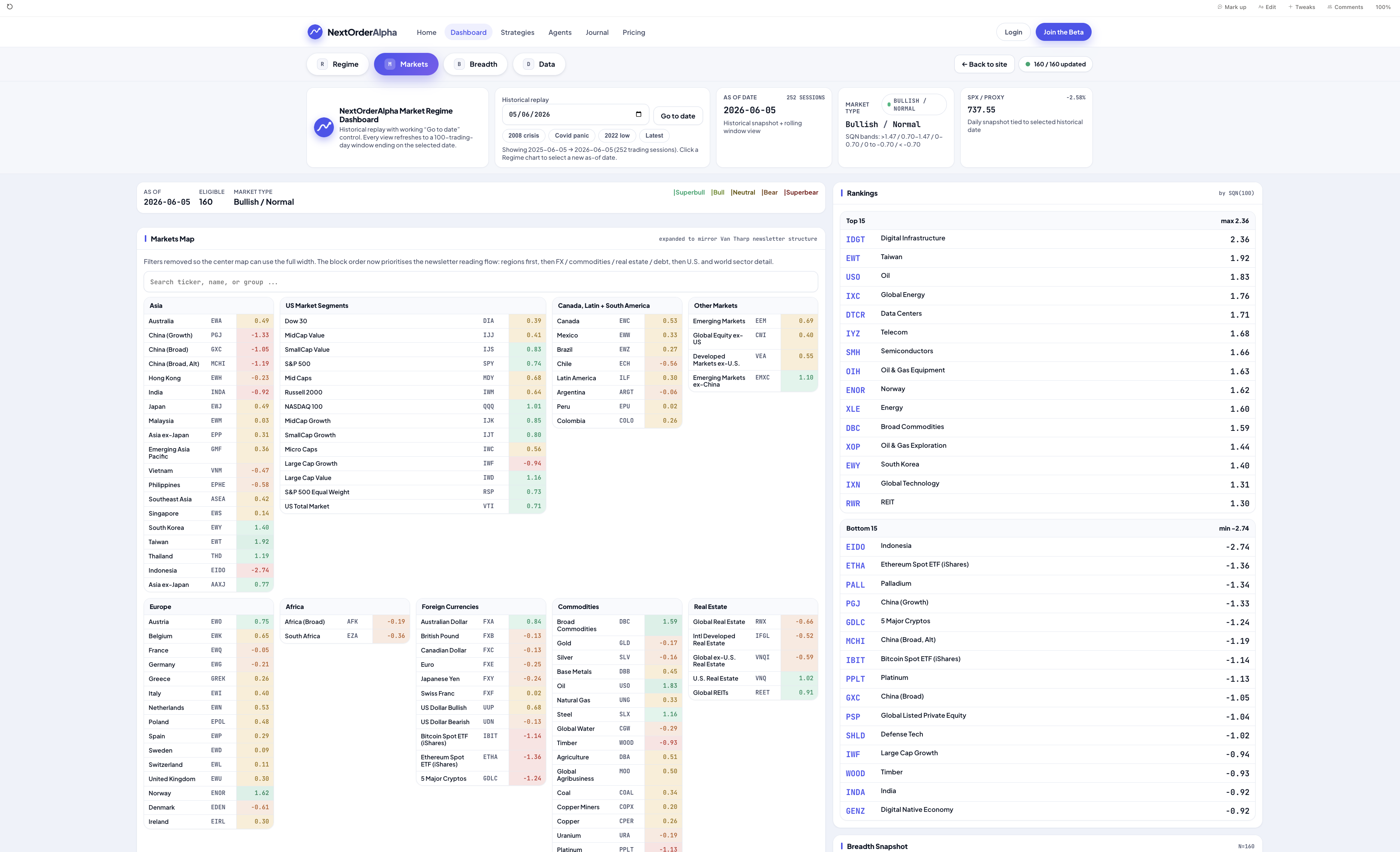
Read the Markets tab
The Markets tab answers: Where is strength and weakness?
Capital rotates — growth to value, tech to energy, U.S. to international, stocks to bonds. The market map is a cross-sectional heatmap of the active universe; each cell is an instrument coloured by its current MQN. Look for clusters, not isolated symbols: one green name can be noise; a full green group can be a trend.
Groups organise the universe like a map — Asia · Europe · U.S. Market Segments · U.S. Sectors · Currencies · Commodities · Interest-Rate Products · Real Estate · Themes. The Top 15 / Bottom 15 rankings show where momentum is strongest and weakest. Comparative rankings show how MQN changed between two dates — often where early opportunity appears, before a move is obvious. The breadth snapshot gives context: a few leaders in a weak universe means selectivity; broad green means expanding risk appetite.
How traders use it: confirm the broad market type (Regime), scan for the strongest groups, look for clusters of improving MQN, compare current leaders with previous leaders to detect rotation, then trade only the instruments that match your tested setup. The dashboard does not say "buy this" — it says "this is where strength is showing up; now apply your system."
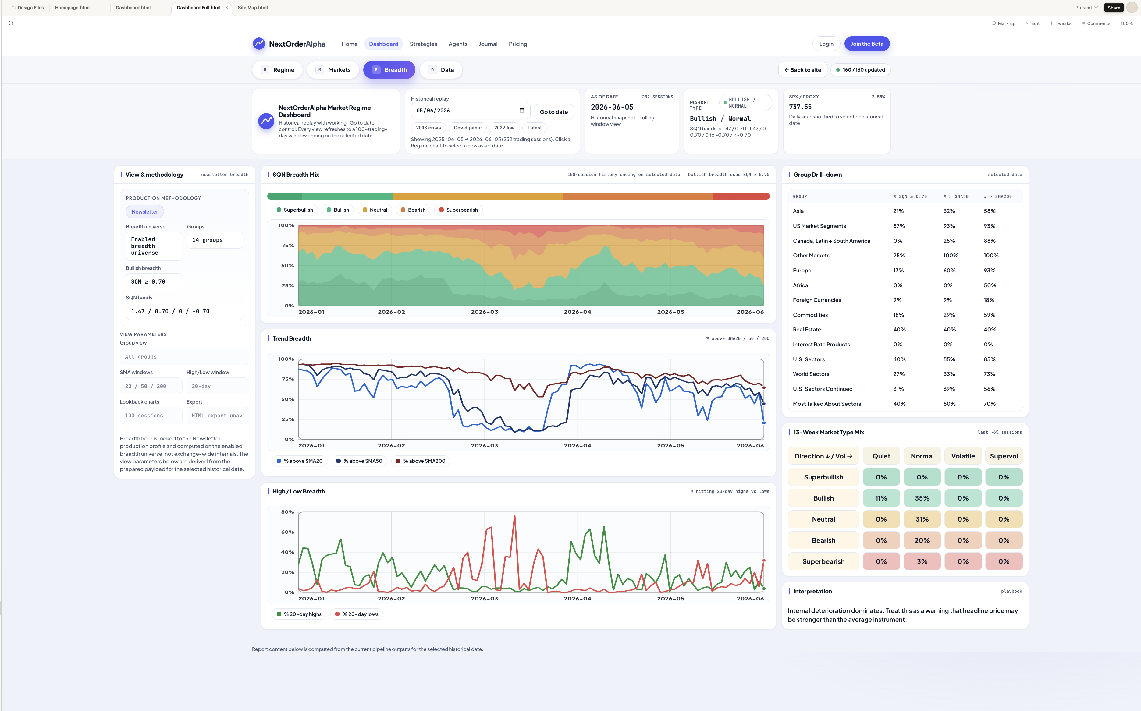
Read the Breadth tab
The Breadth tab answers: Is the move broad enough to trust?
MQN Breadth Mix shows the percentage of the universe in each bucket (Superbullish→Superbearish). Expanding bullish share = broadening participation; expanding bearish share = spreading weakness; neutral-dominated = rotation or waiting. Trend Breadth shows the percentage above the SMA20 / SMA50 / SMA200 — a healthy advance improves across timeframes. High / Low Breadth shows new highs vs new lows: rising new highs under flat price hints at quiet accumulation; fading new highs under rising price hints at narrowing leadership.
The Group Drill-down compares breadth by group — a broad market may look neutral while one group quietly strengthens. The 13-Week Market Type Mix shows how much time the market spent in each direction × volatility combination over ~a quarter — a regime-persistence view. The interpretation panel turns the data into a plain read; use it to focus your judgement, not replace it:
- Price up + breadth improving = participation confirms the move
- Price up + breadth weakening = rally may be narrowing
- Price flat + breadth improving = possible under-the-surface strength
- Price down + breadth worsening = risk is spreading
- Price down + breadth improving = selling pressure may be fading
A daily professional workflow
Use the dashboard in the same order every day.
- Confirm data health. Bad data creates false beliefs, and false beliefs create bad trades. (The data-coverage/QC view is part of the member workspace; on the public dashboard, assume the daily run was validated by the publishing gate.)
- Read the Regime tab. Record price direction, primary MQN, lookback alignment, ATR% state, current market type, and any change from the prior session. What type of market am I trading today?
- Scan the Markets tab. Record top/bottom groups, improving/deteriorating groups, sector and country rotation. Where is capital moving?
- Read the Breadth tab. Record the MQN mix, % above the SMAs, new highs vs lows, group breadth, the 13-week mix. Is the move broad, narrow, improving, or deteriorating?
- Select the correct playbook. Only trade strategies that match the environment — trend/pullback/breakout in bullish-quiet/normal; more caution and sizing discipline in bullish-volatile; mean-reversion or reduced exposure in neutral; defense, hedges, or standing aside in bearish/supervolatile.
- Execute only your tested rules. The dashboard gives context; your system gives trades — setup, entry, stop, exit, sizing, market-type filter, journal record. No dashboard reading overrides your risk rules.
What to write in your daily journal
End each review with a short operating note — for example:
Market type: Bullish / Quiet. Direction: 100-day MQN bullish, 50-day supportive, 25-day improving. Volatility: quiet and stable. Leadership: technology, data centers, global energy. Weakness: homebuilders, weak country ETFs. Breadth: supportive but not universally strong. Strategy: long pullback and breakout only in leading groups; avoid weak groups; normal risk only on high-quality setups. Invalidation: reduce exposure if breadth deteriorates or volatility expands.
This turns the dashboard into a decision record. Over time the record becomes feedback, feedback becomes improvement, and improvement is how trading becomes a business.
Final principle
You cannot control the market. You can control your preparation, your beliefs, your rules, your position size, and your response to changing conditions. Use this dashboard every day to define the market type, locate strength and weakness, confirm participation, select the right strategy, and trade only when your system and the environment agree.
The 20 market types at a glance
Every reading reduces to one cell below: direction (the 100-day MQN band) crossed with volatility (the ATR% state). Knowing which cell you are in is the whole point of the guide.
| Direction ↓ / Vol → | Quiet | Normal | Volatile | Supervolatile |
|---|---|---|---|---|
| SuperbullishMQN ≥ 1.47 | Superbullish / Quiet MQN ≥ 1.47 ATR z < −0.5 | Superbullish / Normal MQN ≥ 1.47 −0.5 to 0.5 | Superbullish / Volatile MQN ≥ 1.47 0.5 to 3.0 | Superbullish / Supervolatile MQN ≥ 1.47 z > 3.0 |
| Bullish0.70 – 1.47 | Bullish / Quiet 0.70 – 1.47 ATR z < −0.5 | Bullish / Normal 0.70 – 1.47 −0.5 to 0.5 | Bullish / Volatile 0.70 – 1.47 0.5 to 3.0 | Bullish / Supervolatile 0.70 – 1.47 z > 3.0 |
| Neutral0 – 0.70 | Neutral / Quiet 0 – 0.70 ATR z < −0.5 | Neutral / Normal 0 – 0.70 −0.5 to 0.5 | Neutral / Volatile 0 – 0.70 0.5 to 3.0 | Neutral / Supervolatile 0 – 0.70 z > 3.0 |
| Bearish0 to −0.70 | Bearish / Quiet 0 to −0.70 ATR z < −0.5 | Bearish / Normal 0 to −0.70 −0.5 to 0.5 | Bearish / Volatile 0 to −0.70 0.5 to 3.0 | Bearish / Supervolatile 0 to −0.70 z > 3.0 |
| Superbearish< −0.70 | Superbearish / Quiet < −0.70 ATR z < −0.5 | Superbearish / Normal < −0.70 −0.5 to 0.5 | Superbearish / Volatile < −0.70 0.5 to 3.0 | Superbearish / Supervolatile < −0.70 z > 3.0 |
MQN is our metric. The parameters are ours; the idea is simple.
The Market Quality Number (MQN) is NextOrderAlpha's own measure of market-regime quality. The inputs and the idea are shared openly — daily price & return series over rolling lookbacks, graded for strength and consistency and paired with a volatility read. The exact parameters and calibration are ours, but the idea is simple and we explain it in plain language.
MQN combines the consistency and size of moves into a single, comparable number across any instrument — 160 ETFs and 115 crypto assets on the same footing. We describe the inputs in plain language and show the bands we use; the exact calibration stays ours.
What we share
- The inputs & idea behind MQN
- The MQN bands and how to read them
- Data health so you know what's fresh
What we don't claim
- No signals, tips, or guaranteed outcomes
- Not financial advice — you make the call
- We keep the exact calibration ours
Read it once, use it every session.
Open the live Dashboards and put the guide to work — MQN, volatility, breadth and leadership in one view.